

The front door. Yes, it’s a vital component of your home, as it gets you from point A to point B. But, it’s more than that! A front door can create instant curb appeal, make a first impression and convey your style. Most of all, it can make you glad to arrive home.
 I’m obsessed with front door colors. The reason is twofold. First, I subscribe to quite a few decorating/home magazines and newsletters, plus I have favorite websites that pertain to the topic. Lately, my eye has been drawn to colorful front doors. It seems everyone is expressing themselves via their front doors.
That brings us to the second reason I’m obsessed. I live in a suburban townhouse community that is governed by a homeowner’s association. The covenants state that the colors of the doors (garages included) and courtyard fencing for each plex must be uniform. That’s fine; I realized that was a fact of life when I moved there almost 30 years ago. However, I’ve been greeted by a front door that has been the same color for nearly 30 years. It’s boring. It’s monotonous. But, I don’t know if it’s worth getting sued if I would rebel and change my door color.
The door’s color – you know, that reddish-orange color that was all the rage in the 80s – is so out of date that it’s probably primed to make a comeback. Actually, it kind of has. Benjamin Moore’s color of the year is called Caliente. It’s described as a “vibrant, charismatic shade of red” that conveys strength, radiance and energy. It almost matches my door color.
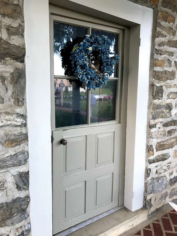
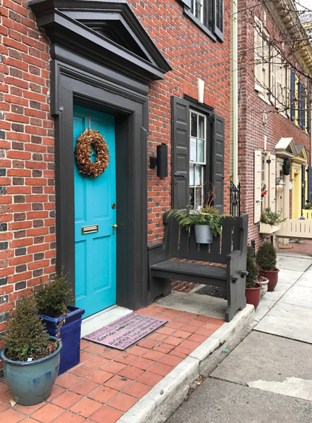 My obsession is driving me crazy. Everywhere I go, I take note of front doors. White and beige hues are certainly in the minority. But, I’ve got to say that homeowners in Old Town Lancaster and the city’s other historic districts have it down to a science. Doors are painted in a rainbow of colors – it’s exhilarating to look at them.
The vibrant doors of art-loving Lancaster began to make sense after I read a “primer” on front doors that appeared on HGTV’s website. It seems the more artsy or quirky a city is, the more daring are its homeowners – at least where front doors are concerned. An interior designer in Austin, Texas, reports, “Austin has a quirky vibe, so you see lots of front door colors such as turquoises, lime greens and gold oranges. Another hot trend is high-gloss black front doors.” A color expert from the Northwest observed, “Bright yellow is a big trend for front doors as well as kelly greens and oranges.”
Janine Arnesen-Nolt, a Lancaster-based interior designer, is a fan of colorful front doors. “It’s fun to use a color that pops,” she says, explaining that a bold, brilliant color you would never consider for interior spaces somehow works when its surrounded by nature. She loves to build on a front-door color via flowers, containers, etc. According to Janine, a front door is a way to set your house apart from neighboring properties if you live in a community in which the house styles are similar. In a circumstance such as mine, Janine thinks it would be nice if homeowners could choose from among three colors for their front doors. The result would be creative uniformity.
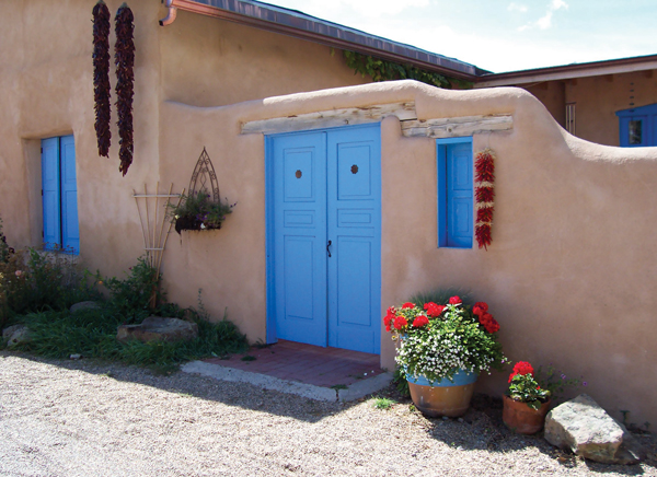 Speaking of artsy towns, Taos and Santa Fe’s front-door hues have always intrigued me. If you go to these New Mexico art enclaves, you’ll notice that nearly every front door is painted a shade that I’d describe as cobalt blue or maybe turquoise or maybe … in actuality, no two blues are the same. There is no bona fide Santa Fe or Taos blue paint color. That was confirmed to me and my sister when we visited a paint store in Santa Fe in hopes of identifying the color. We were told that everyone mixes colors to achieve their own personal shade of blue.
New Mexico’s blue doors do have an interesting story behind them. The color trend is said to have started with Spanish settlers who believed the color wards off evil spirits. Another theory leads to Our Lady of Guadalupe, who wore a blue robe and was said to possess powers that kept those who prayed to her safe from harm. It’s also said that Santa Fe’s blue doors pay homage to the sky. After all, artists are of the opinion that the sky over Santa Fe produces a light that is not found anywhere else in the world.
In Taos, the popularity of a blue door is attributed to the fact that blue represents one of the four sacred directions of pueblo life. Put them together and the theories have evolved into a modern-day philosophy for New Mexico’s residents: Pass through a blue door and you will feel safe and warm.
 Blue doors are also popular in the South – notably along the coastal areas of South Carolina and Georgia – as are porch ceilings painted blue. Here, the hue is collectively called “Haint” Blue, which is thought to be a derivative of the word haunt. Haints are lost souls or restless spirits. African slaves, who feared haints, believed they could not travel across water, so they mimicked the color of water with blue paint and the blue bottles they hung in trees (which gave way to the South’s famous bottle trees) as a way to thwart evil spirits.
Southerners also believed that blue paint keeps insects at bay, which led them to paint their porch ceilings blue. There was some validity in that notion – after all, insects don’t fly skyward. In actuality, there was an ingredient in original versions of blue milk paint that repelled insects.
Again, there is no such color as Haint Blue. Homeowners mix colors to come up with their own shades. But, if you’re not creative, Palladian Blue (Benjamin Moore), Blue Ground (Farrow & Ball), Atmospheric (Sherwin-Williams) and Aqua Fiesta (Olympic) will do the job. I’m thinking of painting the bottom of my deck, which shades my patio, such a color. Hopefully, no one will notice.
 Just the other day I had a “holy grail” moment when a photo of actress Hilary Duff’s double front door popped up on my computer screen. The doors are painted Millennial Pink, which is another one of those colors that cover a gamut of shades. Color-wise, it falls somewhere between Barbie pink and baby pink. Some people describe it as peachy pink, grapefruit pink and ballerina pink.
How hot is pink? Rose Quartz, Pantone’s Color of the Year in 2016, created a frenzy. Described as a “balance of strength and softness,” it set the stage for Paris Fashion Week in January 2017, where every designer sent a pink frock down the runway. In April, Starbucks added its Pink Drink to its year-round menu, and it became an Instagram star. For May’s Met Gala in New York, Zoe Kravitz’s pink dress broke the Internet. June saw Lancome unveil its Absolutely Rose makeup line. In July, Nike introduced its Chrome Blush line of active wear. It was the summer of the flamingo, and sales of rosé wine went through the roof. Homebuyers mad for mid-century put pink bathrooms at the top of their must-have lists. La Creuset introduced a line of pink cookware, calling it a “calming, happy color,” which might explain why it’s defining the color scheme of today’s weddings. Of course, Apple was ahead of the curve – it debuted its rose-gold iPhone in 2015.
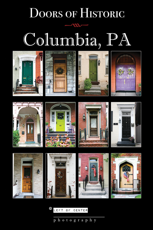
Six years ago, photographer Whitney Luciano took a trip to Italy and became infatuated with the doors she saw and began snapping away. Upon returning home to Columbia, she shared her photos with her father and expressed a desire to turn them into a poster. He encouraged the project, but suggested she could instead “focus” on her hometown, as the front doors in the historic district were awash in color and detailing. Incredibly, the Susquehanna Valley Chamber of Commerce had a similar idea in mind and contacted Whitney to see if she would be interested in undertaking such a project. The resulting poster – Doors of Historic Columbia, PA – was a hit with residents and visitors alike. “So many people asked for a photo of a certain door because it’s where they grew up,” she says of the requests she has fulfilled. The posters are sold at The Mayfly (8 S. Third St.) and the SVCC (445 Linden St.), as well as through her Left of Center Photography website, lofcphoto.com.
Chad Newcomer, the general assistant manager at Grauer’s Paint & Decorating, which has stores in Lancaster, Lititz and West Lawn (Berks County), confirms that expressive front doors are not my imagination. “A front door can add a little spice to your house,” he theorizes, referring to the curb appeal that results. “And, a front door sets the stage for what you will see on the other side of it,” he adds. And, like “they” say about paint, it’s the quickest and easiest way to execute change. “For $30, your house can look completely different just by changing the color of the front door,” Chad notes. And, it doesn’t require the services of a pro. “Anyone can paint their front door,” he adds.
When I visited in mid-January, Grauer’s was undertaking a remodeling project of its own. A Benjamin Moore dealer since 1934, when its original namesake owner introduced the brand to Lancaster, the look of the store and its displays must meet the paint company’s guidelines. To do so, the majority of the walls at Grauer’s were being painted a shade of gray, while an accent wall would be awash in Caliente. The wood-toned display cases were being replaced with industrial-modern-inspired, state-of-the-art (from a lighting perspective) models that would also tap into the gray craze from a color perspective. Flooring also complements the industrial-modern theme.
 “Gray is here to stay,” Chad says of the color. Indeed, many of the 23 colors that comprise Benjamin Moore’s 2018 Color Trends palette include gray hues such as Sharkskin, Dreamy Cloud, Stone, Excaliber Gray, Wolf Gray, Moonshine and Carolina Gull. Chad likes gray for several reasons: It’s a transitional color that has many moods depending upon the light, and it pairs beautifully with warm or cool colors. “It really reacts to light,” he says. “It can look totally different during various times of the day. And, it has undertones of other colors.” He notes that Grauer’s top-selling color is Benjamin Moore’s Revere Pewter.
Chad adds more front-door observations. He reports that a high-gloss finish is trending. “It delivers a totally different feel and look,” he says, using words such as “richer” and “deeper” to describe the effect it creates. He also likes the texture that a high-gloss paint delivers. “It’s a good choice for someone wanting a unique look for their front door,” he says.
Another tip: When choosing a color, consider the direction the door faces as the light will affect it. Also, keep in mind that the glass in a storm door will alter the color, as will the screening in a screen door. He also suggests that you paint the storm/screen door to match the color of the front door.
How does Benjamin Moore designate one color – out of more than 3,500 in its portfolio – as its Color of the Year? Seven of the company’s color and design experts conduct a year-long research project that takes them around the globe. Last year, the team visited 30 cities in 12 countries. They attended numerous design and industry shows and snapped tens of thousands of pictures that literally documented the world of fashion, architecture, pop culture, furnishings, art, etc. Collectively, the color red stood out. In the estimation of these experts, red is a color that represents change and drama. I think they nailed it.
Leave a Reply